
 About me
 Works
Works Contact
Embrace the weird:
The road to a better imagery
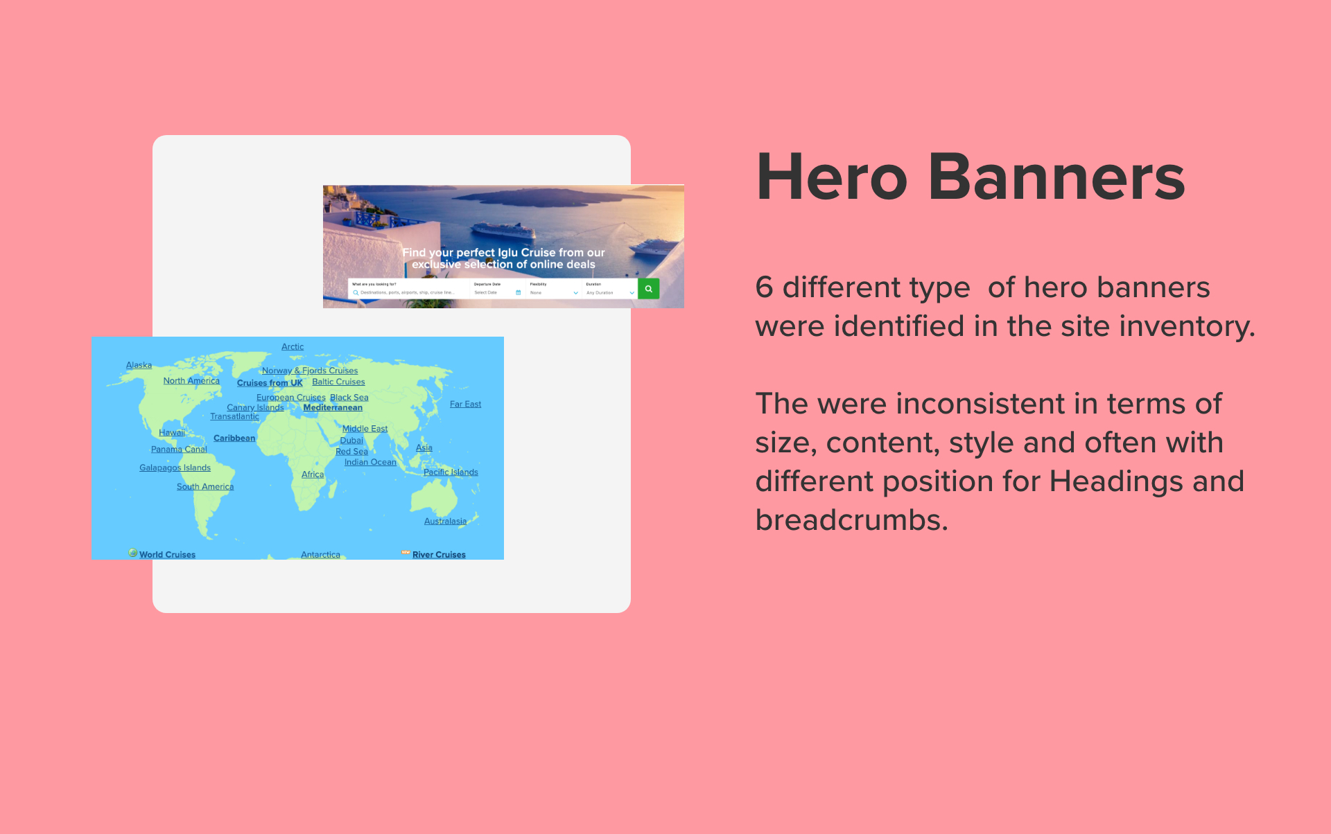
How we dealt with inconsistent aspect ratios
With 2 other designers and the rest of the product team, including many front-end developerps, I co-create and maintained the Adobe XD library for our design system. I have also had a role implementing the design system in a modular HTML/SCSS library.
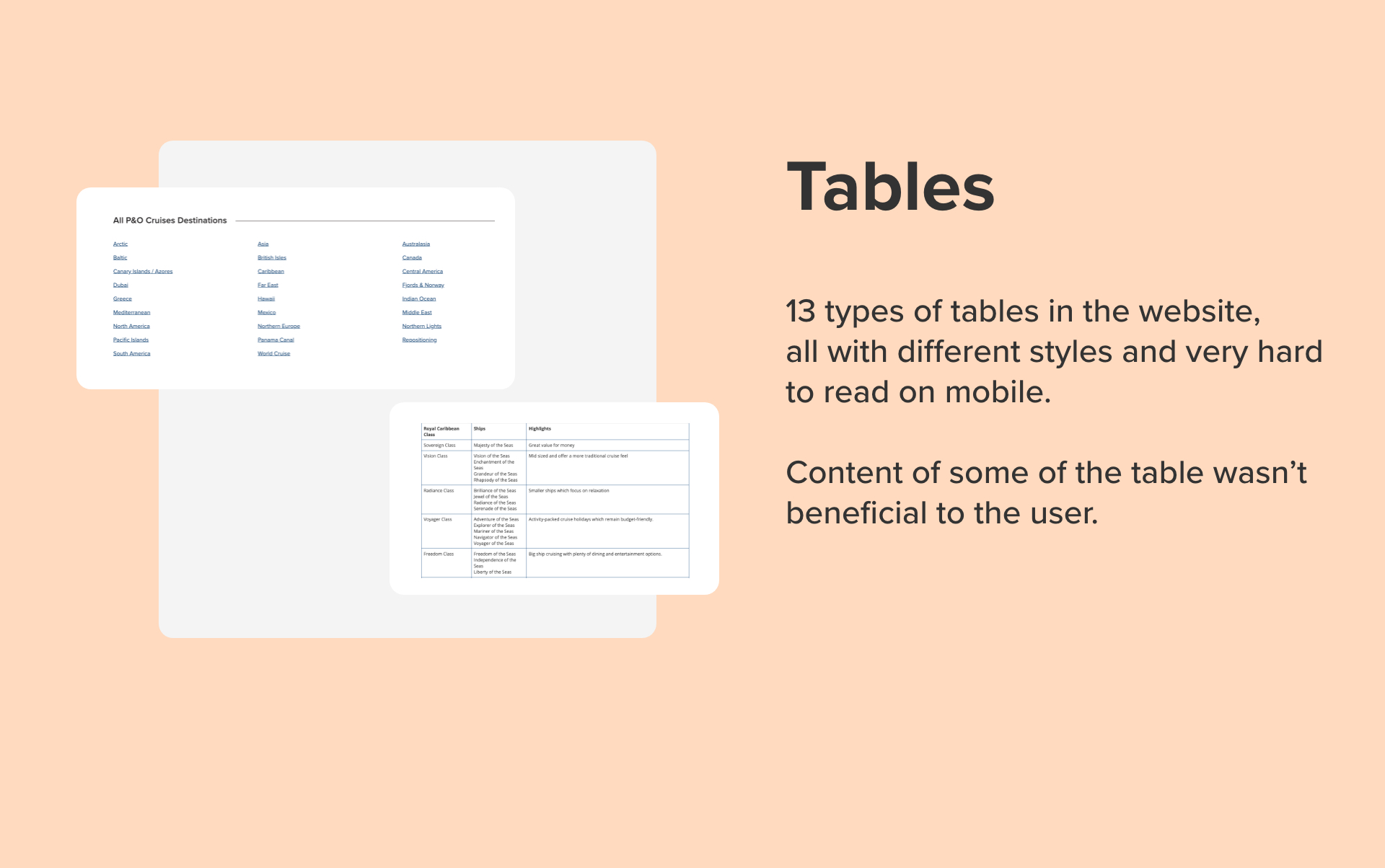
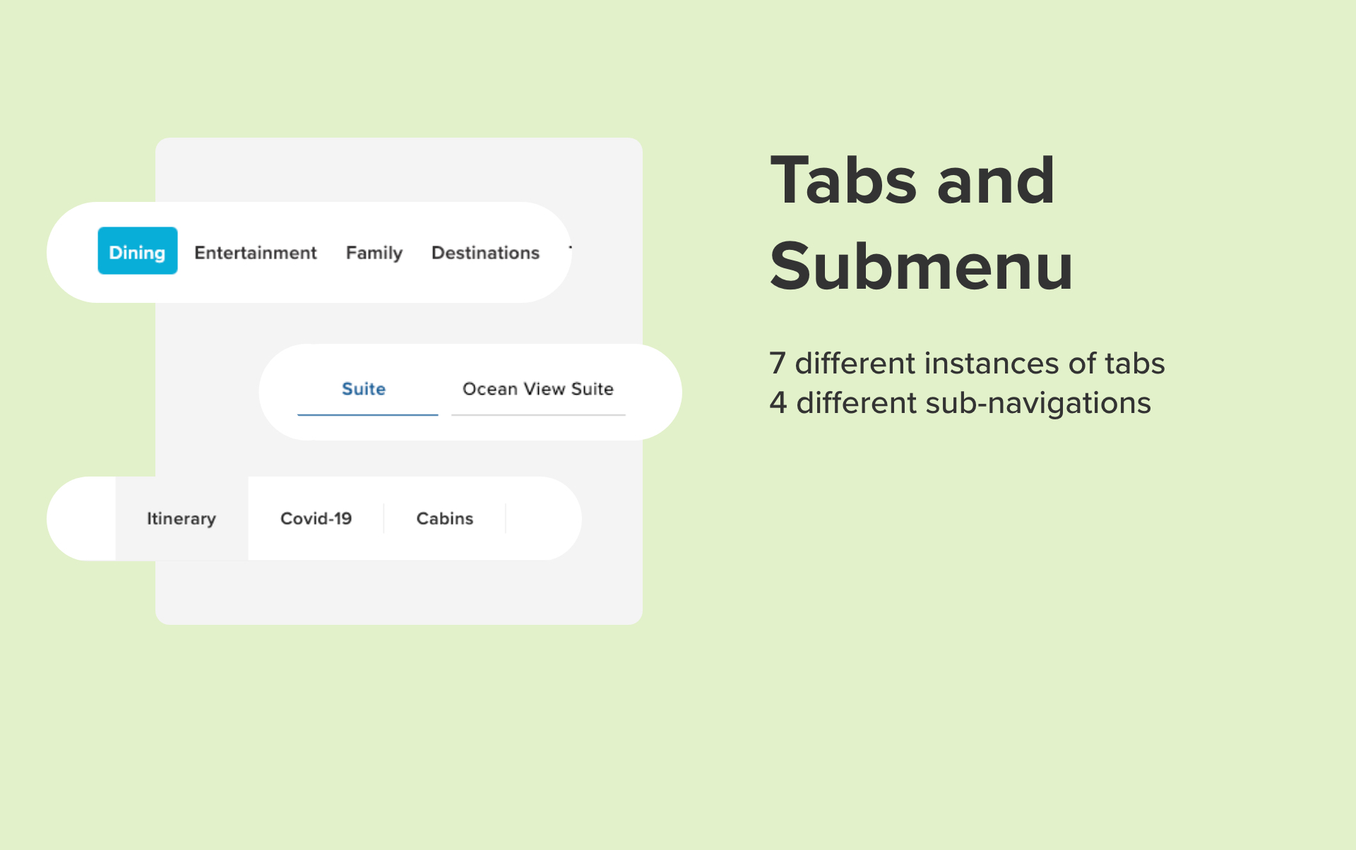
Following an inventory of every single component in the website, we realised we had many duplications at micro components level but also for more complex widget. Because of the old codebase, we had a series of inconsistencies across all pages that were generating many bugs and causing problems to our AB testing work to improve website performance.
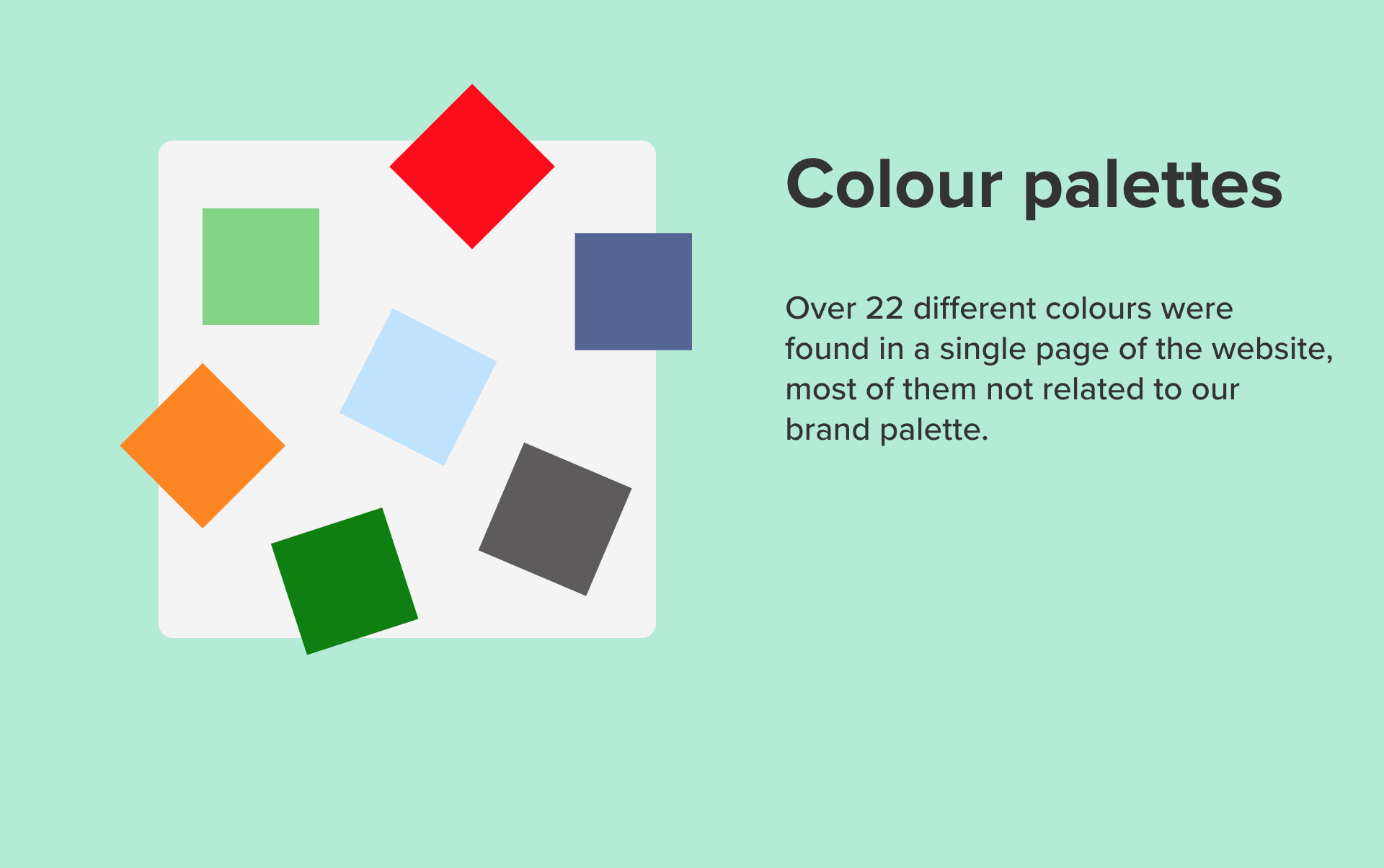
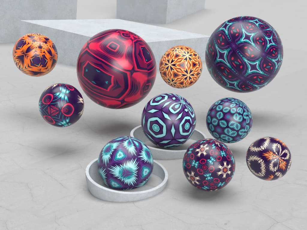
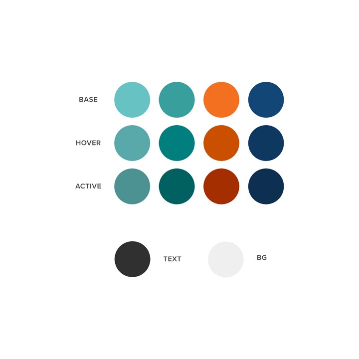
Over 22 different colours were identified in one single page, including multiple shades of the same green or blu. We decided to start using colour variables to create a sense of consistency around the colour palette and simplify the workflow for the front-end team.
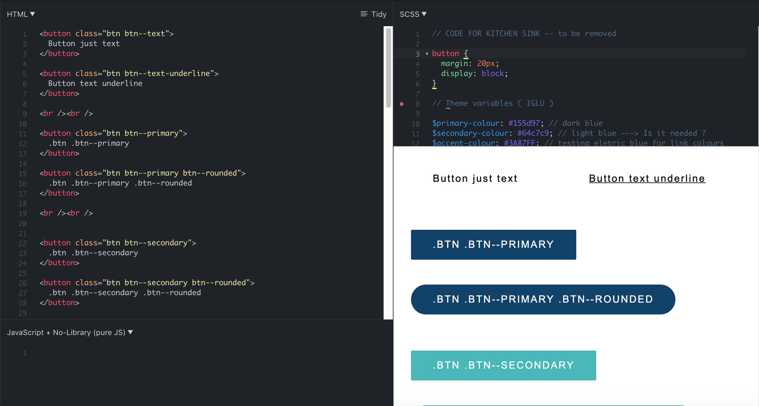
There were over 10 different styles of buttons in the website, with code for each button scattered amongst multiple files and class names.
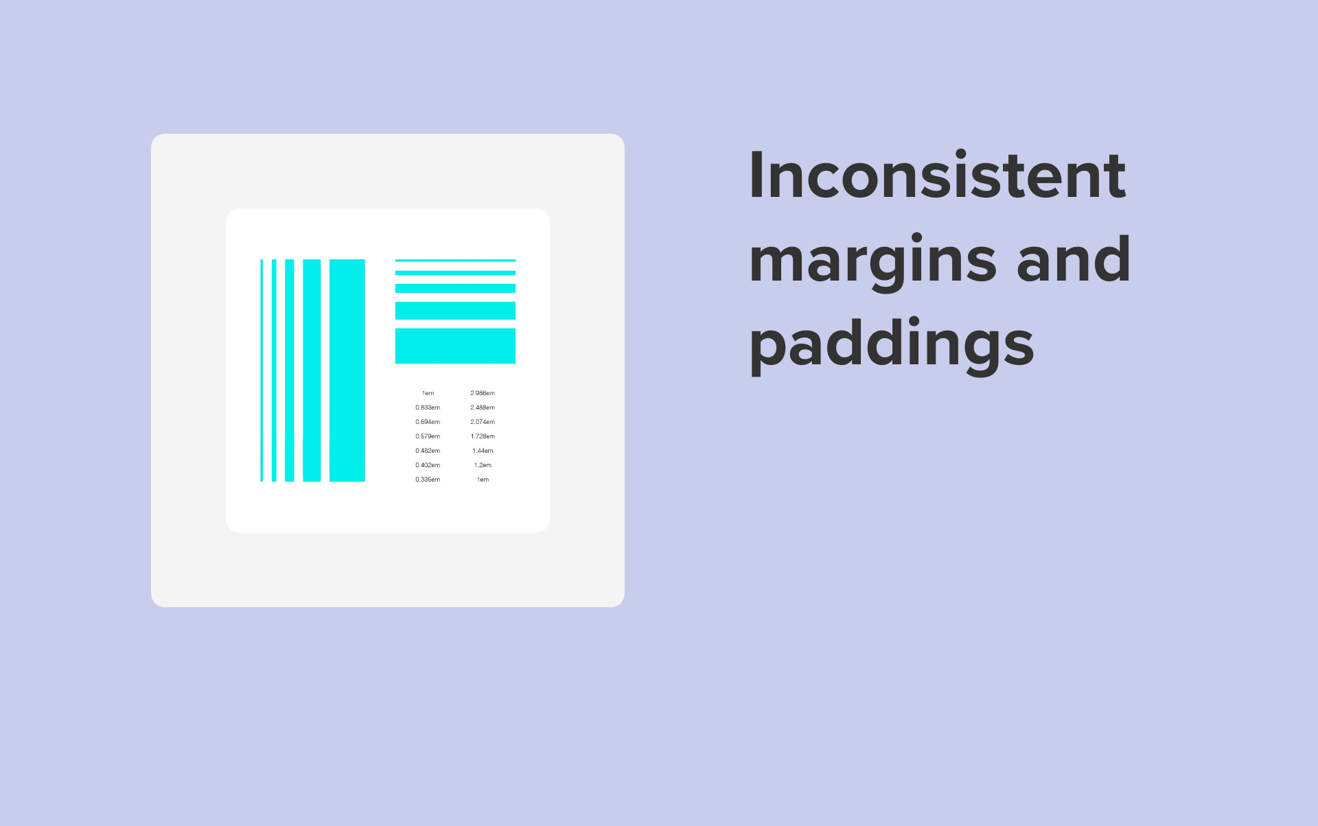
Spacing and margins were all over the place in the website. We agreed to use a modular scale to restrict the choice of the value that designers can pick.
You can’t innovate on products without first innovating the way you build them Alex Schleifer, Airbnb
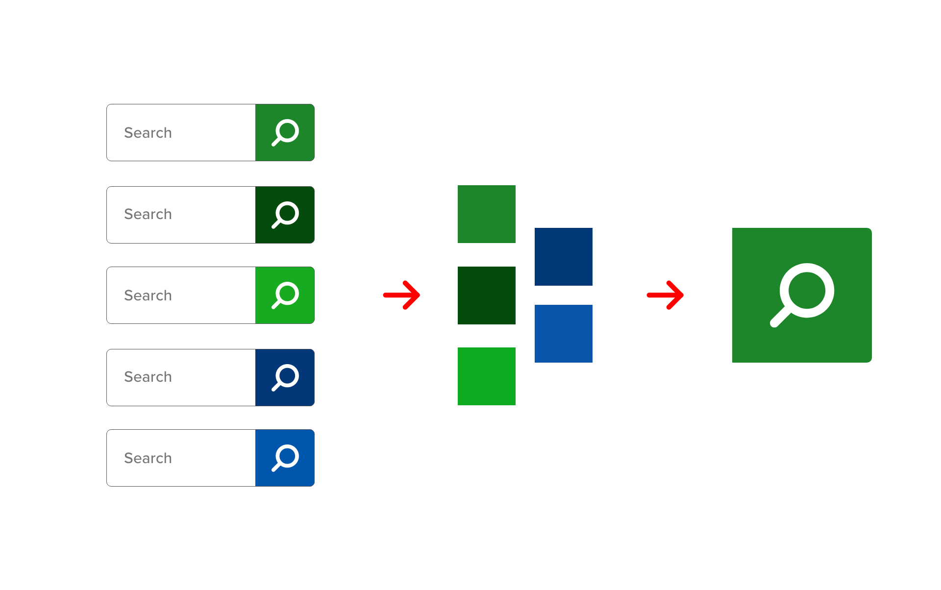
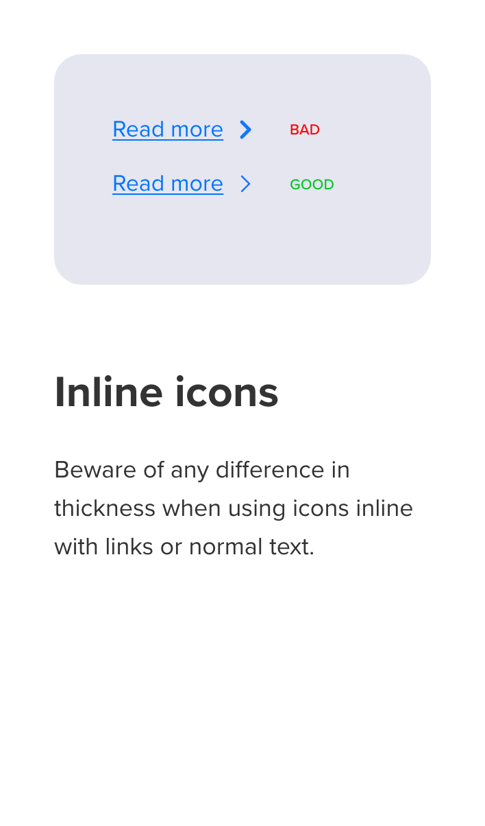
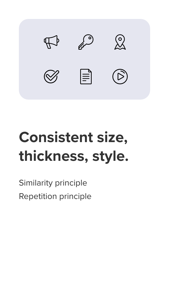
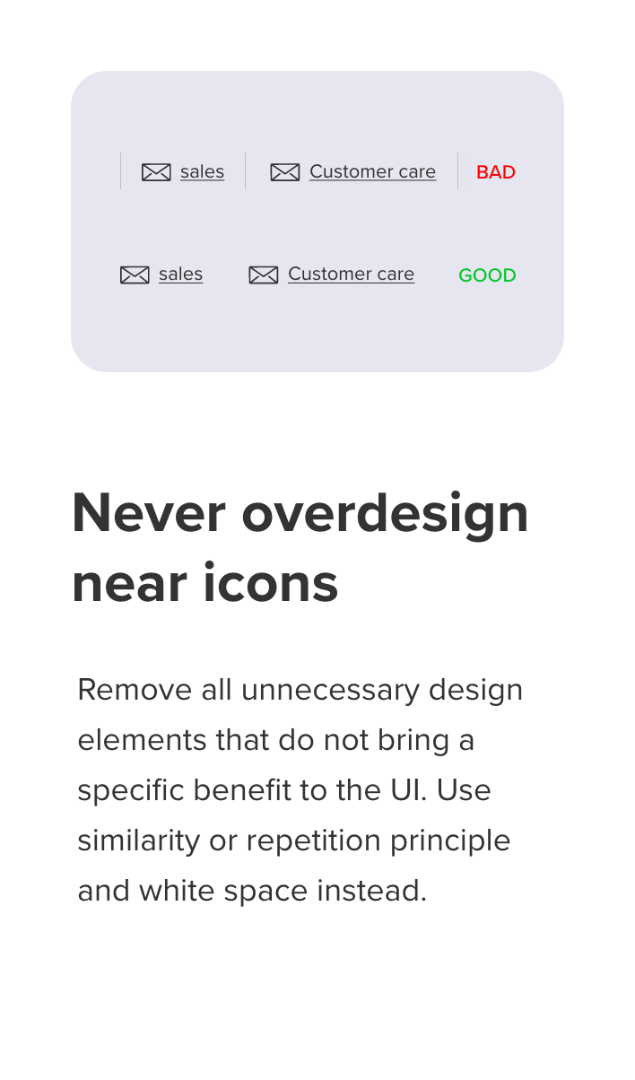
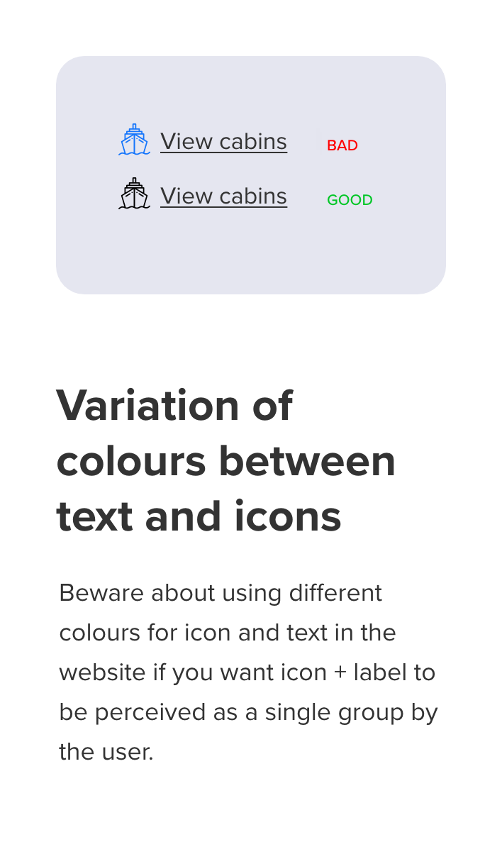
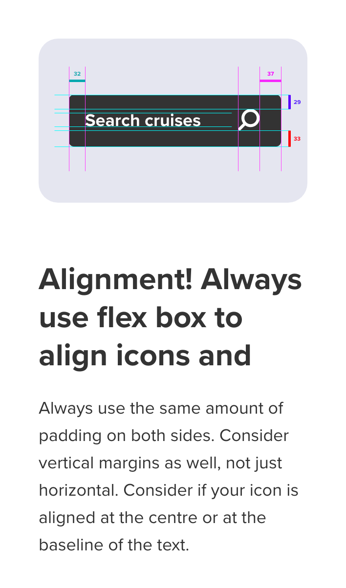
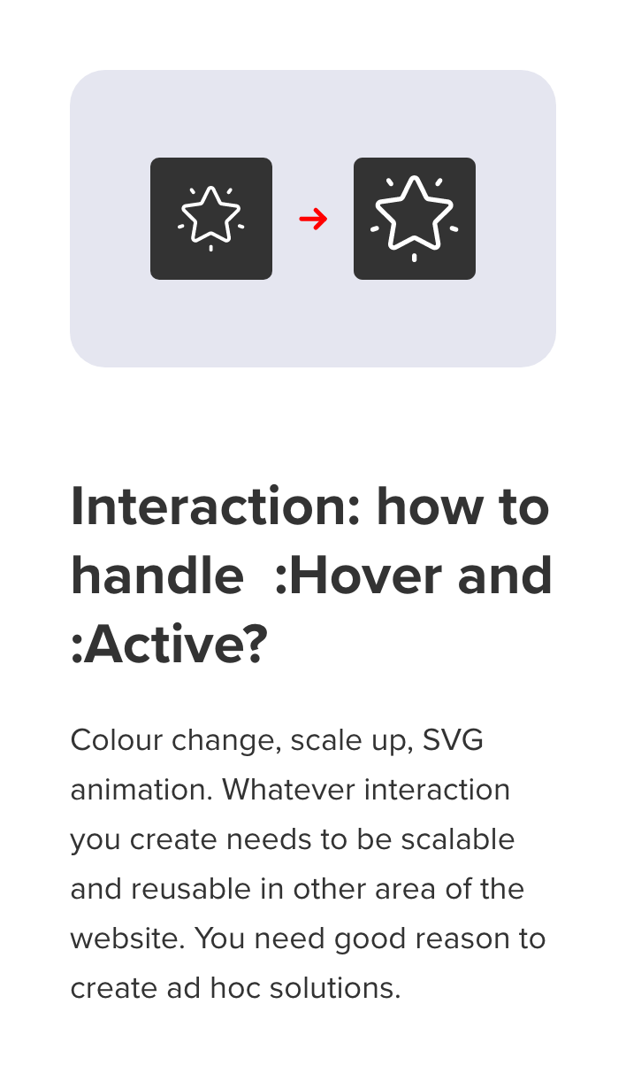
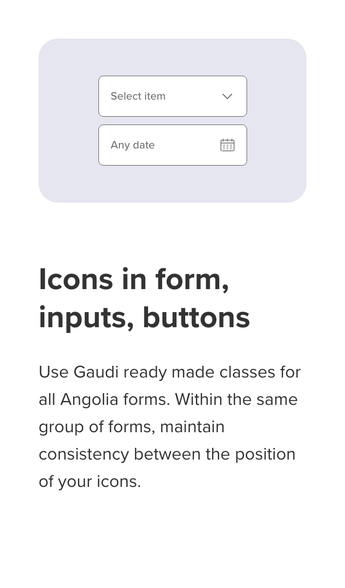
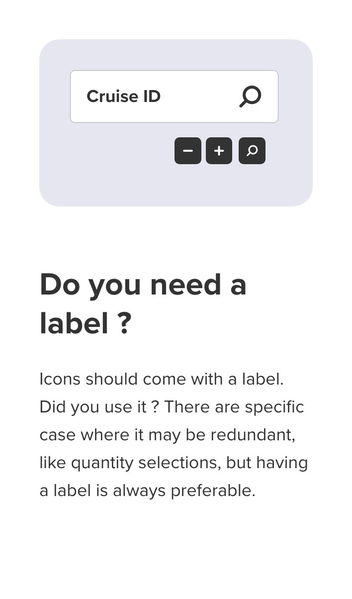
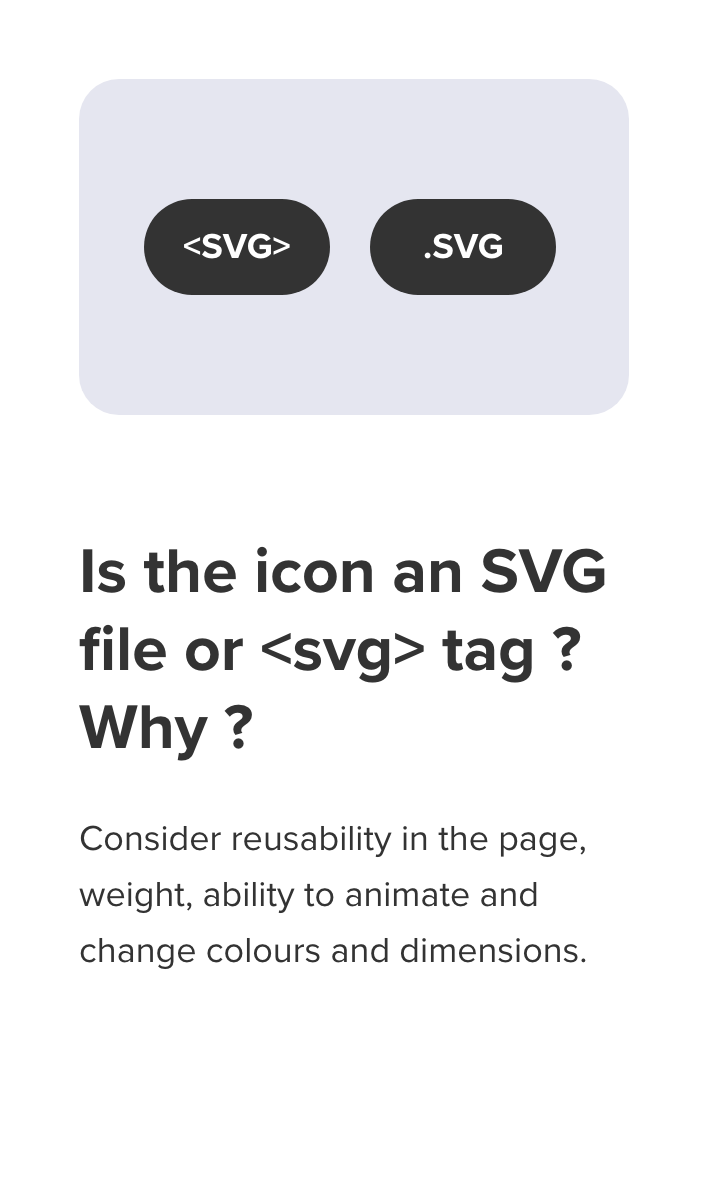
Not just our icons were very different in terms of thickness, colour and style but we also had different standards in how we used them in the website. Guidelines were created for the usage of icons that would help preserve consistency in the website: Thickness, colours, alignment, size, style, positions, purpose.
I have used the site inventory to group all icons and elaborate a clear, "yes or no" set of questions for the whole team. This made it extremely easy to agree on guidelines for icons. Please see below a series of opinionated decisions we took related to the
use of icons in our website, and a few open questions as well that we did not answer just yet.
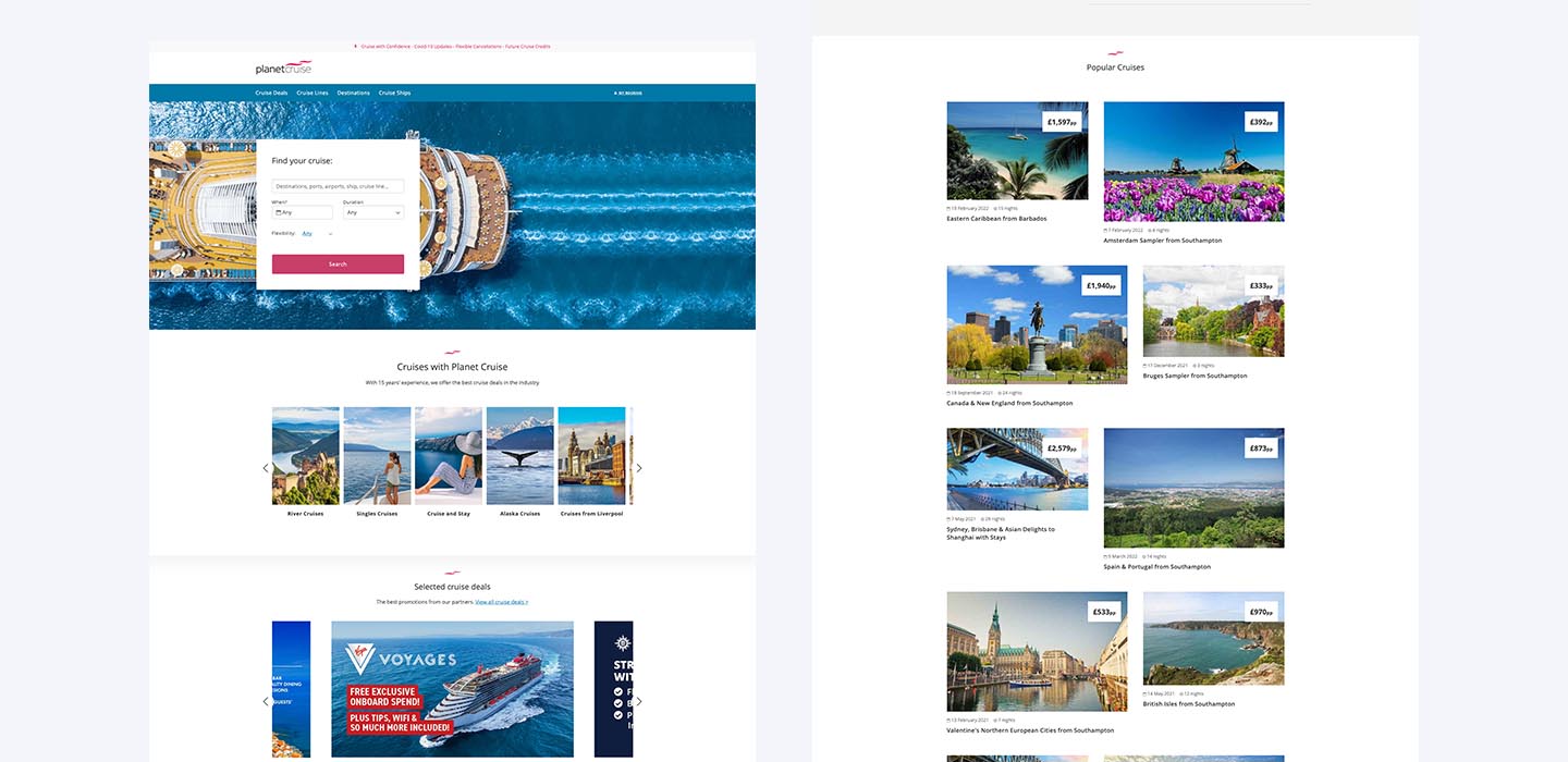
How we dealt with inconsistent aspect ratios
In the current website we were sending mixed signals about the identity and the principle that drive our brand. Most of the components were over-designed, full of small inconsistencies and not focused on their role in the user flow. We decided to react by simplifying all the components to the bare minimum by removing any non essential design element, but at the same uniform copywriting and imagery to convey the most important message for our brand: holiday, relax, fun, luxury, unforgettable experiences. This led to the creation of a website simple to use, with a strong and memorable visual character driven by imagery.
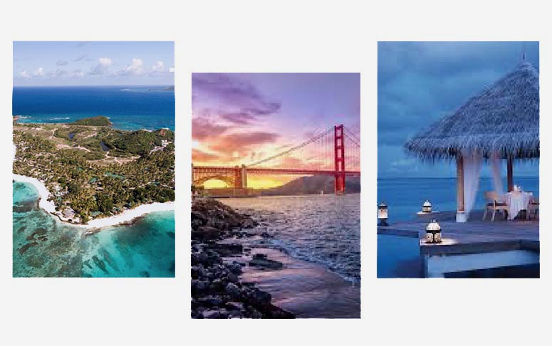
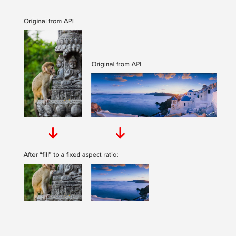
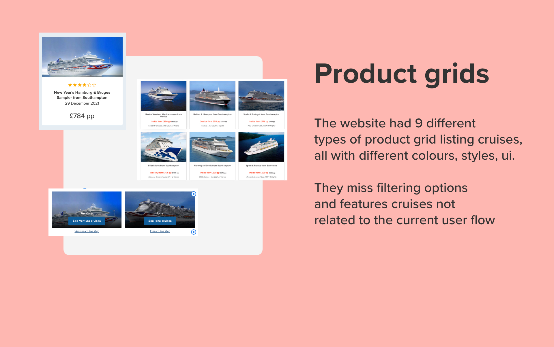
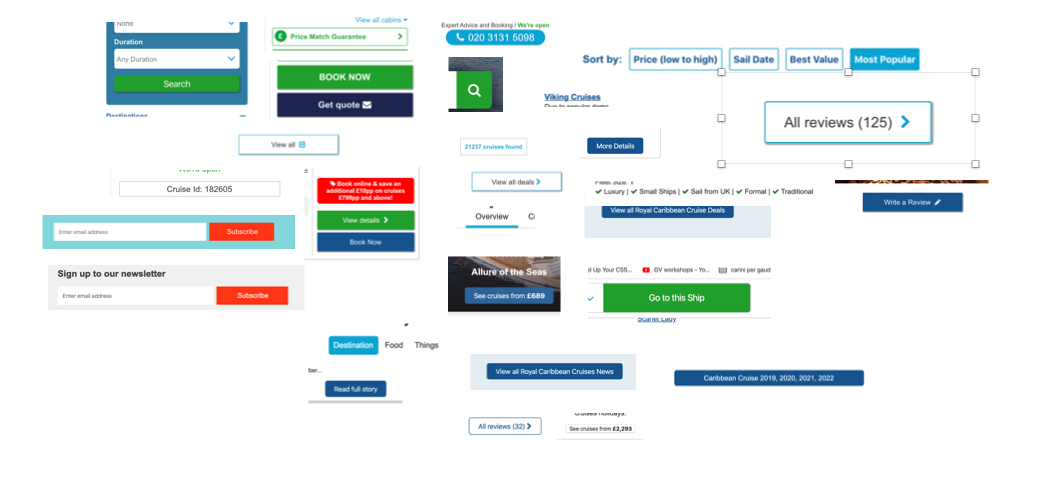
We get many of the images in the website from different cruise lines, each one with their own APIs. There is no uniformity in the aspect ratio that we receive, we are expected to show landscape, portrait and squared photos all inside the same product grid. At the moment, we were obtaining a consistent aspect ratio by "filling" a predefined area with the photo that would work for many aspect ratios. This resulted in very uninspiring use of photography across the whole site, as most of the photos were cropped on one of the sides by around 30% of their surface.
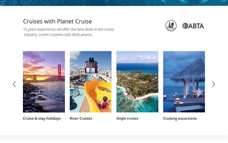
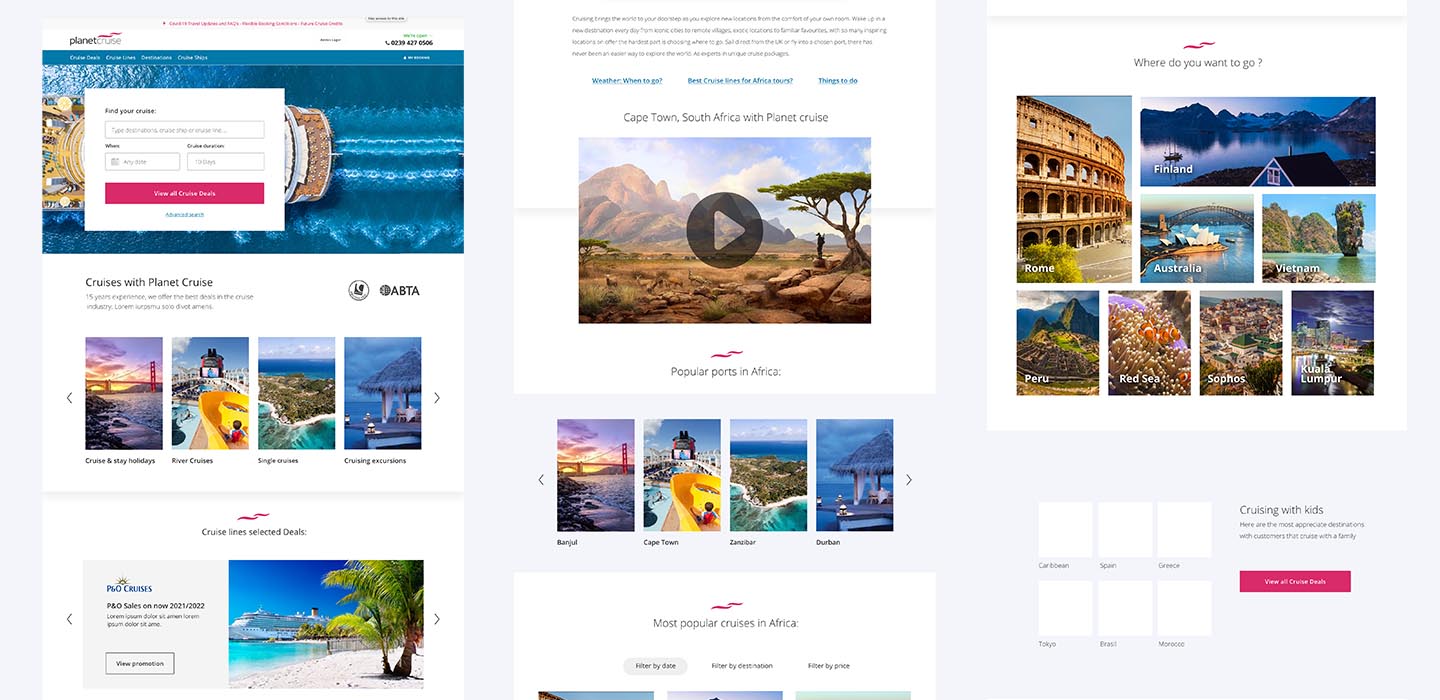
Rather than fighting the different aspect ratios and constraining them to a grid, we have decided to embrace it, and make it a peculiarity of our brand look and feel. In the grid at the right featuring different cruises, we have used the :nth-child(odd) selector to create a certain degree of randomness in the width of our images.
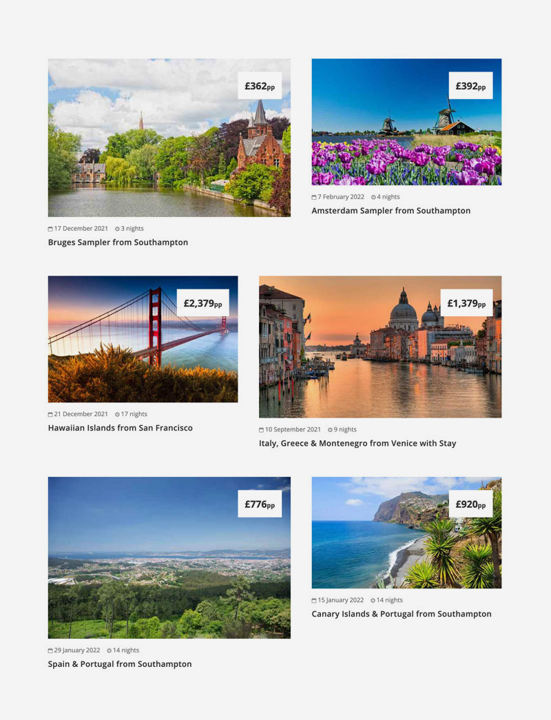
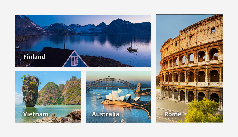
We wanted to fully commit to our visual and put the CSS grids layout system in use, to serve a very unusual list of recommended destinations. Now when we need to use images on the website we always try to offer unusual crops or to mix different crops together. I believe this is not only solving our original problem, but also reinforcing our brand principles and giving it a strong and easy to recognise character.
Consistency and standards ( colours, icons, spacing, animation and other platform conventions). Is there a design element, a feature or an interaction that is not present anywhere in the website?
Flexibility and efficiency. How easily we present the data in different viewports? Do they require manual entry or recurring updates from the content team in order to work?
Error prevention, blank status, contextual data.
Business value of the component, base on current conversion, goals and its position in the 3 most important user flows.
Aesthetic and design. Is it in line with the look and feel of the website? Are there design element that do not have a precise function? How is the hierarchy of each element of the component ?
Many design system fails, and we did not want that for our creature. While working at the project, we split it in smaller tasks that could be resolved within a sprint, and often aligned with other business goals like improvements on a specific area of the website. We decided to focus on building a practical pattern library that could be integrated with the current website styles, and use it to slowly replace all legacy components of the website. Bringing order and uniformity to the website was done as part of each ticket, rather than a stand alone project.
To fit the needs of a front-end team of 15, we have created guidelines around how we structure style bundles and how code in HTML and SCSS:
Sharpening the axe, in design terms is creating small and reusable components ready to be imported in any design file and maintained by everyone using shared libraries. In the code we created small SCSS partials for each reusable component and organised them in easy to find folders. This style is loaded everywhere in the site and did not affect any of the existing components, as we have used a dedicated prefix "gaudi-" in all our classes in order to facilitate the migration while keeping easy to read class names.
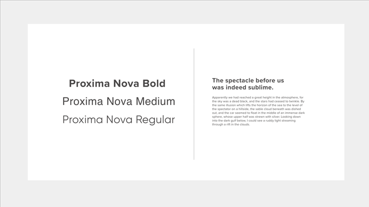
We updated the typographic reset style and adapted it for the new font (Proxima Nova) and simply reduced the base font size on mobile to guarantee consistency with the legacy components and have more readable headings. Paragraphs and other micro components like buttons and inputs retain the minimum font size of 16px across all devices for better accessibility.
I am not a big fan of bootstrap-like utility classes... in the long term they are a Maintainability nightmare on complex projects. However, there are cases where they could be very helpful and could really improve maintainability when used with intention. Our button library for example works entirely with utility classes, created in 4 separate SASS includes that are used to select button styles, sizes, colours and style button groups.
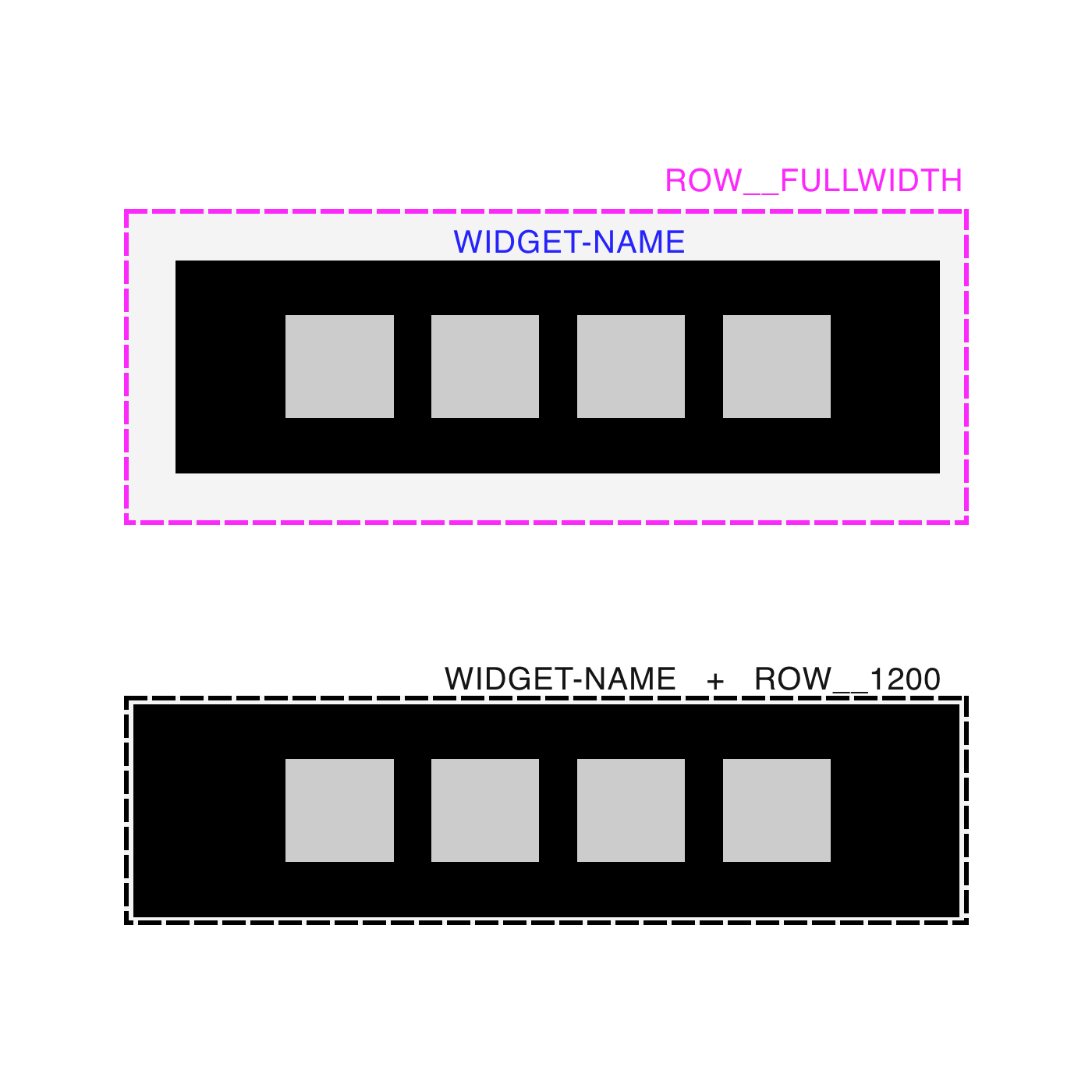
We use BEM to create independent components, fluid by design thanks to modern layout techniques that require almost no media queries to work responsively. Having to fight legacy code we have decided to adopt a very important abstraction: separate the geometry of each component from it's style. This is a very effective way of slowly adopt the new library while maintaining the legacy components in the website at the same time.
We manage to create several strong and reusable components, built on top of our new pattern library that over time drastically reduced the time to create a new page or functionality.
Most components were designed mobile first and work in a fluid way across different viewports, including large screens. They were built to leverage the default fluidity of flex and CSS grids layout, with a very moderate usage of media queries.
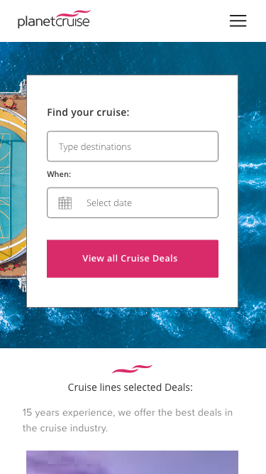
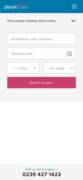
The "Search cruises" widget is the most crucial aspect of our UX flow and we decided to place it below the header in every page. This is the solution that was most successful during AB testing, where the search is always one click away, even in the mobile menu.

Every time a new component of the pattern library was integrated in the website, we were closely monitoring the affected pages, looking for anomalies. Each one of the pages had its own Key Performance Indicators that includes Conversion rate and bounce rate, but also specific Goals set for the page and sometimes specific KPI on selected widget within the page. We have found a sweet compromise where developing our design system wasn't an isolated task, but rather was made in conjunction with the day to day product design work on the website.
We had a solid pattern library loaded on the website and thousands of line of 10 years old legacy HTML/CSS, buggy and hard to maintain. What really made the difference for us was the so called boy scout principle: "Always leave the campground cleaner
than you found it"
Everyone in the team was applying a new element from the pattern library to the old codebase. In no time, a good part of the legacy code was converted to the new system. Overall, this project is still
ongoing, but already transformed the design process of our team and set a very high standard for all future work.
This was a very high impact project that created additional work for the whole team, on top of their day to day tasks. I consider it overall a success but often happen in complex projects, a few things also went wrong.
I like to reflect about the success and failure of everything I do, and try to learn from my mistakes.
Fighting the legacy reset style and the overlapping framework.
This caused a few delay and bugs at the beginning of the project. We tried to fight it by using BEM and applying
a unique prefix on our classes to avoid style clashing. If I had to start everything from scratch I would probably spend a few hours to clean up the legacy codebase and remove high CSS selectors specificity, all the "!important" declarations
and the opinionated styles assigned to basic HTML tags.
We debated "look and feel" decisions too early in the process When we started the pattern library we also set the tone for what we wanted to accomplish, in the form of a Northern
start design which had a lot of aesthetic decisions like colours, thickness, radius of all border, margins and paddings. However, we had to come back on our steps a few time while building the actual library, to make it work with our real
life scenario. If I had to start the project again I will focus more on mapping the current data and how the components interact with it, rather than how they look.
We are slowly integrating the pattern library with the current website trying to uniform the style of each page with the new layout. The flexible system we have created allows us to quickly transform an old page or component just by editing HTML and very little addition of CSS style.
The next effort for the team will be working towards a set of design principles to work in tandem with our pattern library. These are not company "mottos" but rather a clear statement on the specific value we want to give to our users, that will drive our decision making process along the way, and that we can use to better justify our design decisions.


I would like to know your thoughts on this case study, please help me do better. Complete the survey and claim your free Candy bag. Average completion time is 3 minutes.
Start the survey